
The purple creates a softer feeling. Next time I think I will change the card base color. I think it might need a little more contrast.

Have a great day! ~Rhonda
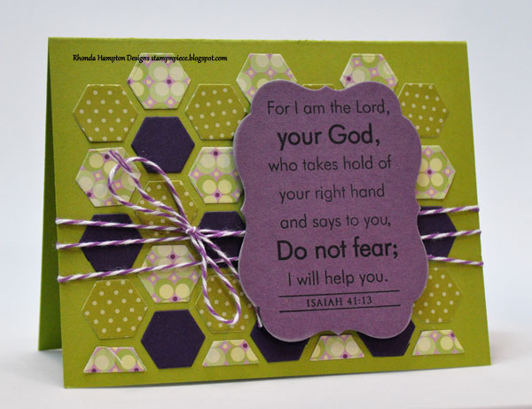
supplies used:
stamps: PTI - Beautiful Blessings
ink: Memento Tuxedo Black
paper: PTI Kraft, Simply Chartreuse, Plum Pudding, Royal Velvet, Stampers Select White, Simply Chartreuse pattern pack; Cosmo Cricket - pixie-licious paper pad; Crate Paper - Portrait collection paper pack
other: PTI Hexagon Cover plate, Mat stack #4; The Twinery - Liliac


Oh I love your cards, esp the second one. So graphic with just the right colours. -Irma
ReplyDeleteBoth are beautiful! I love the way you left an opening for the second one and the first one has such pretty colors. Beautiful verse, Rhonda.
ReplyDeleteThe 2nd card is beautiful... and I love this sentiment so so much!
ReplyDelete